


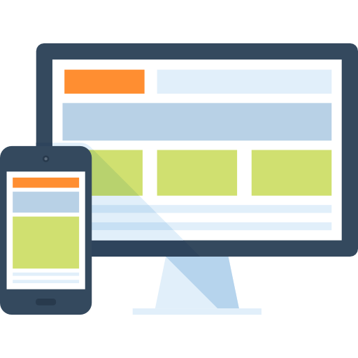
Web design principles determines the success of any website. It all depends on the designers who designed the website with focus and determination or not. The utility and usability of your well-designed website influence the success of it and not the visual design.
The website is the face of your store and potential buyers will first have a look on your website than the store. Hence, the website should be in the topmost condition and should look alluring. If your website does not make a good first impression, it could be the end of your brand impression.
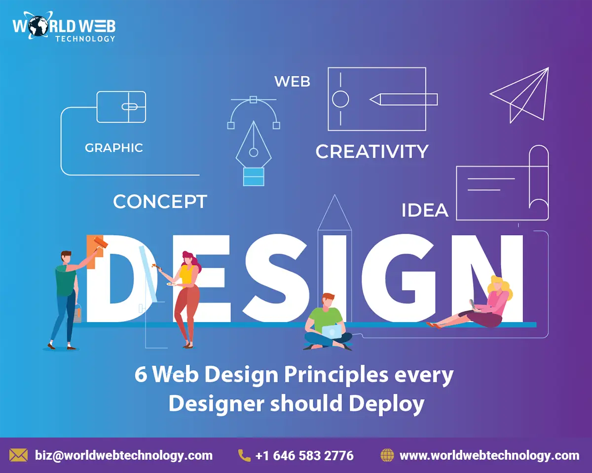
6 Web Design Principles
Web page design is very important for improved conversation rates than one may assume. If the design is poor in quality then it does not matter how great of a conversion-boosting tactic you have. Website design is all about how your page works and customers generally do not pay attention to the visuals or the infrastructure of the website.
A website that is well-structured and has incredible usability will perform well on Google. The websites that have poor user experience have fewer user views than websites with commendable user experience. The effectiveness of a website influences the performance of a website.
Here are the 6 web design principles every developer should imply while designing a website!
1. Visitors must be guided through directional cues
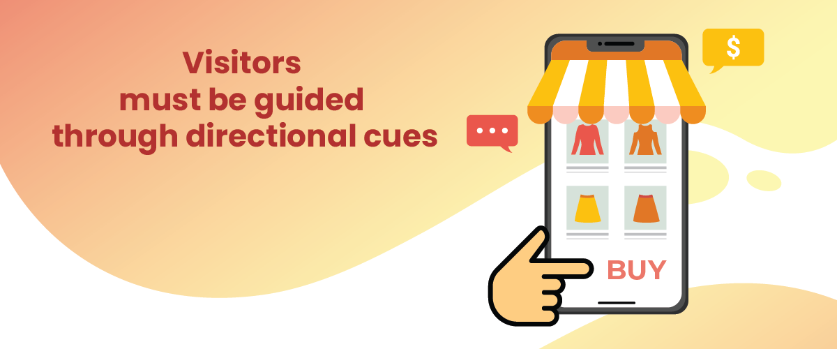
Make sure to add directional cues to your website to guide newcomers to the place where they want to look. Whether it is a lead-gen form or a call-to-action, the cues should be pointing towards a conversion goal. However, directional cues don’t need to be arrows. They could be a few fingers pointing towards a certain goal or a slight tilt of the head of the person you used in the image. It could also be a paper pin or man other alluring visual cues.
2. Efficient use of WHITESPACE
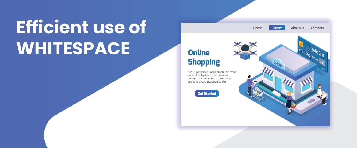
The whitespace helps you to realize how convenient it is for the eyes of your website’s pages. The visitors will probably leave if they find difficulty in reading the content from your web pages. Hence, you need to build visually soothing whitespace.
Remember to use the whitespace on your page in a witty way.
Below are some of the things that you can do:
- Increase the whitespace by having shorter paragraphs instead of blocks of text that could make the content of your page more readable.
- Try to prioritize and maximize the white space between the main elements of your page like the footer, sidebar, header, and the body amongst others.
- Make sure you check the line heights and build enough for the size of the fonts you are using.
3. CALL-TO-ACTION must be Prominent
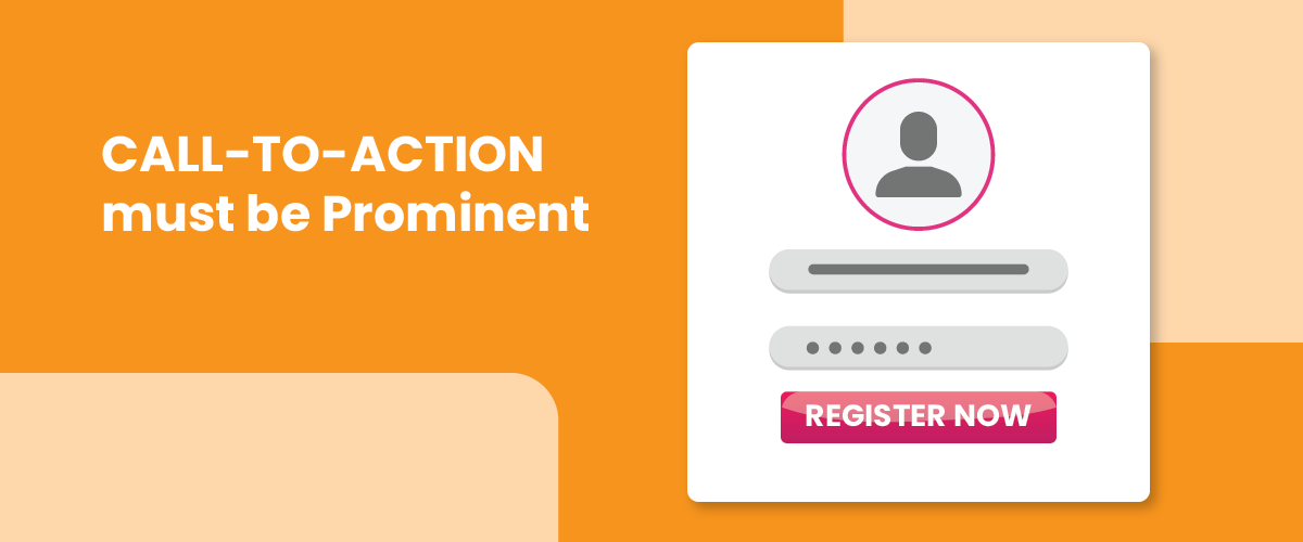
The pages where you aim to generate leads should be designed with a call-to-action button in it. However, if your visitors can hardly notice it, having a CTA button is useless. This is the reason why the CTA button should stand out than the other elements of the page which includes the heading as well as the content. You could make contrasting borders of CTA with the rest of the page to make it look eye-catching. Just make sure to make it look apart from the other elements of the page.
4. Be Picky in COLOR Selection
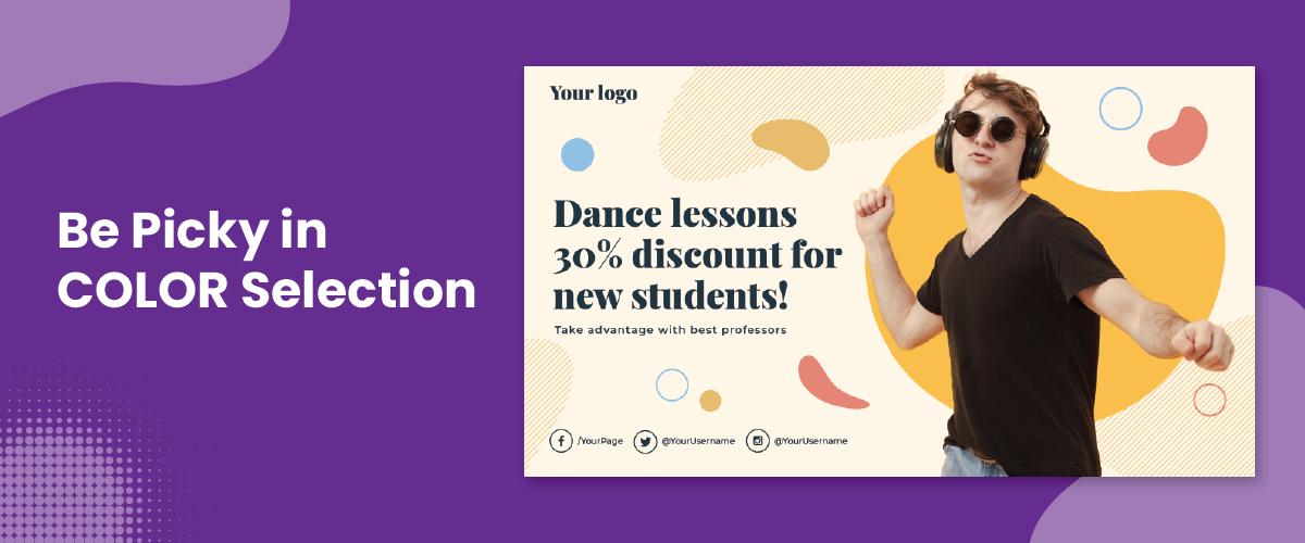
Always be picky when it comes to colors. Take your time and decide which ones would suit your website the best. Different variations in color combinations will give off different emotions and immensely affect the vibe of your website. Hence always ask the question of what brand is your website for before deciding on a color. What message and image do the brand wants to relay to its targeted audience?
Consumer decisions can be affected by colors. Some of the instances are green making people think of health, vitality, and nature, black evokes class, power, and strength, and red represents urgency.
The overall color scheme must be chosen concerning the color contrast with your headlines and call-to-action button. The accent colors must be kept reserved for your CTA button as it is an important element on your website.
5. Make use of HICK’S LAW
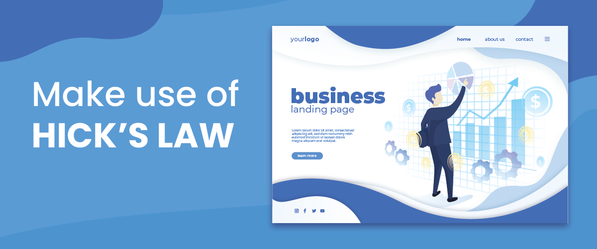
William Edmund Hick was a psychologist who stated a law that says that a person will take as much time to decide on the number of choices he is provided with are offered to him.
This translates perfectly in the web design world to provide your customers with a plethora of choices which in turn will also boost your client conversions. However, make sure not to overwhelm them with too many links in the navigation bar as this strategy could be irritating and the customers may leave your page altogether.
A must-read: 8 Ways Artificial Intelligence (AI) can Influence Web Design and Development
6. Consider THE RULE OF THIRDS
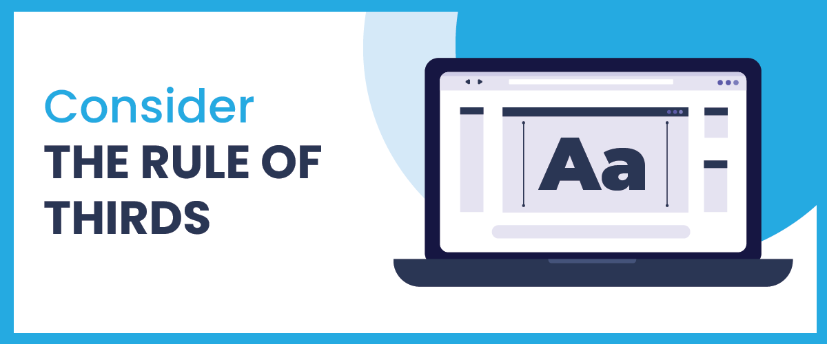
You should know the rule of thirds if you have done some professional photography. It states to divide an image, or in this case your website, into thirds, vertically and horizontally. This would result in your page bisecting into nine equal sections. As a guide, now you should make use of the middle four intersections where you should add all your efficient and important design elements of your webpage. This may include your product image, a review, the call-to-action button, or a tag-line that the web customers might want to focus on.
Synopsis
Above-listed are the most prominent and time-tested metrics that you must suggest to your website design services company. Hire a proprietor company that follows web design principles and offers web designing services in India for the best results.
World Web Technology
World Web Technology is an India and USA-based Web Design, Web Development, and Mobile App Development Company that offers creative and proven web solutions around the globe.
Most Popular Categories
Discover top categories on our blog, featuring WordPress, PHP, eCommerce, and Shopify insights and tutorials.


Featured Insights
Immerse yourself in our passion for sharing the latest industry news, cutting-edge technologies, and insightful articles. Explore the depths of knowledge with us.

10 Proven Strategies to Increase Customer Lifetime Value with WordPress