The arsenal of web development tools available to skyrocket your website’s user experience to the next level is enormous. From back-end development hacks to front-end immersion techniques, you absolutely have to explore multiple world web technologies to ensure that your website stands out among a crowd of millions.
If you are wondering which web world technologies are the hottest trends this year, look no further. Here we break down the biggest trends in web development to incorporate into your platforms.
1. Progressive web apps
Progressive web apps are hyper-specific platform apps whose only purpose is to enhance user experience on a website. This includes surging response speeds, advanced loading speeds, and boosting capabilities.
Why are progressive web apps gaining traction?
- Capability – Tap into a trove of resources from C, C++, and other ecosystems for performing high-level tasks. These include interactive animations, image compression, etc.
- Installable – Progressive web apps are hosted in the native PC system rather than a browser window. This means that they can be accessed at any time without compromising your RAM speeds. They allow you to reduce the total appl size and cut down on crashes.
2. Artificial intelligence and bots

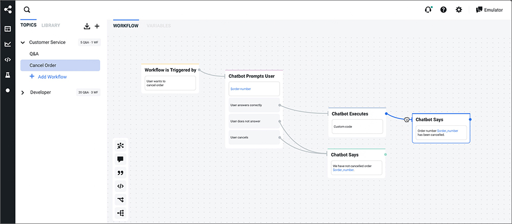
Using AI and bots is an example of harnessing the latest website development technology to give users an engaging and responsive experience. Chatbots are the most commonly used bots on websites.
How do bots work?
- Chatbots are automated with an advanced comprehension of natural language. They are useful for establishing the user’s primary requirements and directing them to the website’s appropriate page.
- For example, you can program the bot to prompt: “How can I help you today?” and offer options like “troubleshooting”, “customer service”, “online store” etc. Alternately, the user can simply type in their response, and the bot picks up the right keyword and offers the programmed suggestions.
3. Accelerated Mobile Pages (AMPs)
Accelerated Mobile Pages are one of the fastest-growing world web technologies today. Put simply; AMPs make mobile usage of a website a lightweight process. The HTML code used by AMPs is stripped down to make loading as rapid as possible.
Why use AMPs?
- When you enter a search string in Google or Facebook, the search results will throw up cached versions of websites. When you click on one of them, the browser will take you to the “hosted AMP page” within milliseconds. The loading time of these pages is faster than of regular HTML web pages by 70-100%.
A must-read: 6 Web Development Trends To Follow In 2026
4. Single Page Applications (SPAs)

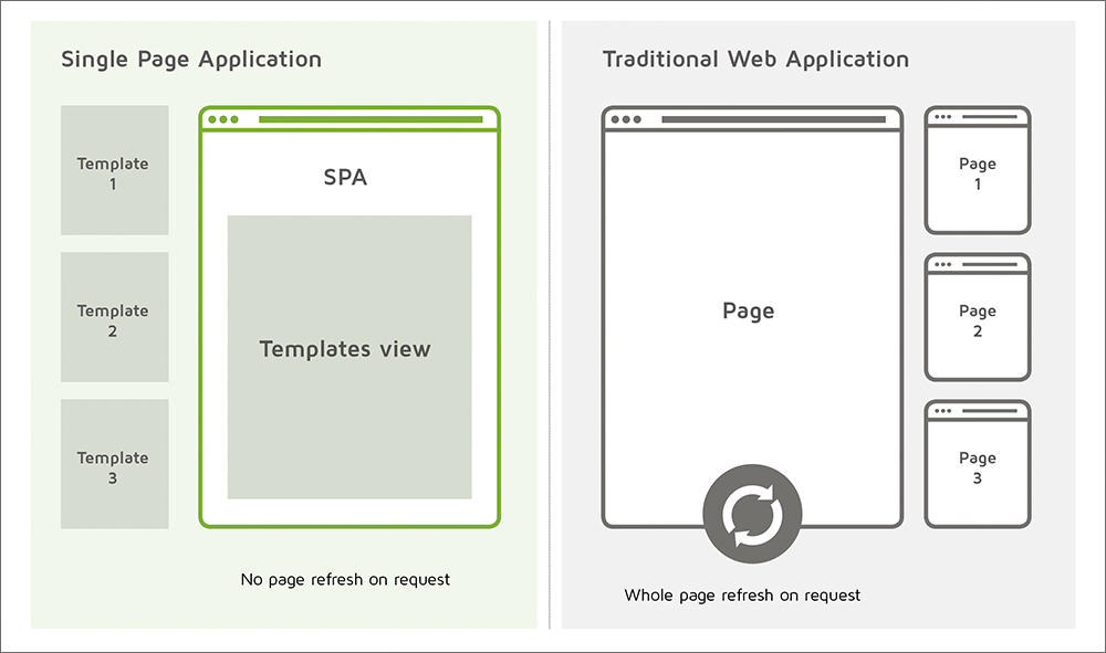
Think of an application like Google Maps or Gmail. They are hosted on a single page without needing any reloads, page-switching, or migration. These are single-page applications. SPAs are built for optimizing page response times and minimizing the need for loading dozens of individual pages.
SPAs are not new web technologies, but recent developments in SPA applications like Github have shown just how powerful and swift they can be. They are easier to code, debug, and optimize for mobile usage.
5. Voice search optimization
The ability to give commands by speaking to your device is one of the best web technology developments of recent years. The total volume of voice searches has grown over 35 times in the past ten years. More people are using their Alexas and Siris to search the web than ever before.
Therefore, voice search optimization accounts for the use of natural language and conversation style in your SEO strategy. Use longer keywords (an average of 5-6 words) and less “mechanical language.” Optimizing your website for voice search will make it visible to the millions of people who prefer speaking the search string rather than typing it out.
6. Responsive Web Design (RWD)

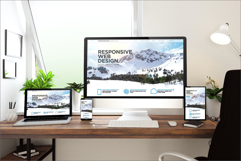
As the number and type of devices used for accessing the internet have increased, web developers have faced the need to optimize sites for each device. Responsive Web Design is a world web technology approach of curating a website for the exact kind of response expected on a particular device.
Using RWD, you can customize your website’s UI/UX for mobile, PC, tablet, or Kindle usage. This means tweaking resolutions, fonts, image placement, etc. to fit the hardware. It also works with the user’s specific software responses, for example, if the user browses with a VPN.
7. Motion UI
To ensure that your website users have high engagement with your content, you must create an immersive and exciting environment. Motion UI is a website development tool that lets you create the best interface and effects to capture the user’s attention.
Why should you use Motion UI?
- Choose from a library of pre-designed animation and transition effects to give your web page a dynamic feel.
- Customize any effect for your requirement using the well-stocked mixin library. It lets you create animations for welcoming users, confirming orders, adding pop-up elements etc.
8. Automation testing
The testing phase of any software is crucial for weeding out glitches, identifying bottlenecks, and determining user-friendliness. Usually, this is done manually by testing every section individually. Thankfully, automation testing allows you to minimize or eliminate the human component of software testing by letting the automated tool run through each part of the test suite repeatedly.
Why is this a good idea?
- Test automation is economical and time-efficient.
- It reduced the probability of human error.
- It can run independently, freeing up your human programmer to attend to more complex processes.
- It is ideal for testing multilingual websites.
9. Serverless applications and architecture

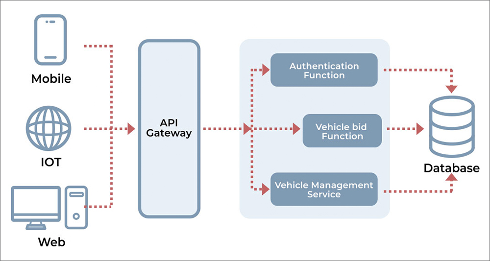
Harness the full extent of web technology developments to reduce your dependence on always-on servers. Going serverless for your platform simply means that you outsource the Maintenance of hardware and server processes. This means that you are not burdened with managing a large server on-site, and instead, use external backend services like AWS.
Serverless applications and architecture have the advantage of being more cost-efficient. You need not invest in hardware management capacity. The service provider also takes care of troubleshooting. You can reduce your operational and scaling-up costs significantly.
10. Mobile-first design
As a web developer, you are aware of the exponential growth of mobile users in the past 3-5 years. This is a trend that will continue growing; hence the methodology of web design has adapted to serve mobile devices better. Mobile-first design starts off the website architecture and design with the constraints of a mobile device in mind.
So, create the page design, user interface, text, and graphic elements, response buttons, etc. for a mobile device first, and then scale it up to fit a tablet or PC’s requirements.
What Web Development Technologies Are Best For You?
First, evaluate your development capabilities and user requirements. If you want to build a small-scale platform that does not need expensive server management, opt for going serverless. If most of your user base is logging onto your site through mobile devices, you must explore RWD and mobile-first design.
If you want to integrate any of the mentioned technology in your web application/website, then contact a web application development company.


