


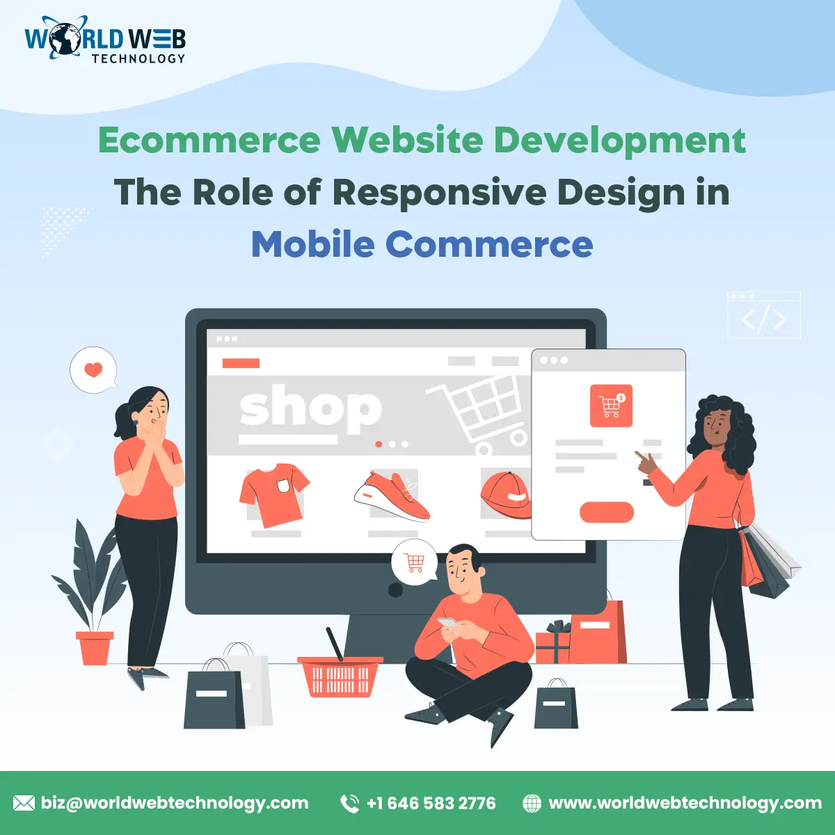
For any ecommerce business, it is essential to have a fully functional website that works smoothly. However, users may visit your website through various devices, including laptops, smartphones, and tablets.
To serve these different types of customers, one solution could be to build different websites for each interface type.
However, with responsive website designing, a website would automatically adjust to the screen size of the device on which it’s opened. It improves your content presentation and marketing.
In this article, we will discuss the role of responsive website design in the Ecommerce industry.
If you are looking for a professional web developer in the UK, consider analysing the list of top web development companies in the UK at SelectedFirms, a B2B marketplace of IT and web development and customers. It can help you find the best ecommerce website development company for your website development.
Understanding Responsive Website Design
Responsive website design means a website that automatically adjusts its content according to the user’s device. It removes the need to create two different websites for desktop and mobile operations. A traditional website may cause inconvenience to the readers in case they switch devices.
For example, if your website contains two columns, they will appear on a single screen on a laptop. However, the reader might need additional scrolling to read the content on a mobile screen. In the case of a responsive website, all the components of the website, including additional text and images, get realigned according to the new screen. Hence, a single design works on all devices without distortion, making it particularly advantageous for Headless B2B eCommerce solutions.
How Does Responsive Website Design Work?
Responsive websites work by observing the user’s behaviour, orientation, screen size, and operating platform. A website has various layouts, grids, and elements that define its structure and flow.
In a responsive design, these elements are synced with each other to align proportionally according to the device screen.
This happens because responsive websites work on fluid grids. Therefore, designers use proportions instead of fixed pixel sizes to size down elements.
When a switch is made to another device, the website created with responsive design adjusts automatically for altering scripting abilities, resolution, and screen size.
The use of CSS media queries, along with a mix of flexible layouts and grids, enables this process. CSS, or Cascading Style Sheets, is a language that controls the visual appearance of web pages. It works alongside HTML and JavaScript, which are the building blocks of the web.
Besides these features, the website can also have additional abilities.
For instance, some websites can automatically detect the presence of a Virtual Private Network (VPN) on a device. This helps them cater better to their audience.
Advantages of Responsive Ecommerce Website

Although creating a responsive website for your Ecommerce business may feel daunting in the short term, it has various long-term benefits. Let us discuss these benefits in detail below.
Better User Experience
Providing users a seamless website experience is the first step to increasing your sales.
A responsive website gives a better scrolling and navigation experience and improves the overall quality of content presentation. Users no longer need to magnify or alter content according to their devices. This results in better customer satisfaction and improved sales.
Improved Google Indexing
Google prefers websites that have a responsive design layout and rely on CSS media queries for their functionality.
A website with a single link makes it easier for the Google algorithm to understand what the content is about.
This leads to more accurate indexing of the website on search results.
Meanwhile, on non-responsive websites, the algorithm may need extra effort to index two versions of the same webpage.
Additionally, no extra Googlebots are needed to crawl the website with responsive design.
Another possibility is that Google may mark your website as a copy-pasted version of its mobile version. This may result in the elimination of content, disrupting your sales.
Faster Loading
If a website takes too long to load, users will likely skip the page and move on to the next result. Along with disrupting user experience, this issue may also affect your brand image and professionalism.
Responsive websites can reduce server time significantly, loading websites faster across all devices. This is done by reducing the number of plugins needed, HTTP requests, and optimising imagery.
Time-efficient
Content updation is an important aspect of staying relevant in the e-commerce industry.
In the case of traditional websites, you need to update the content on two different pages separately.
This may require additional time and resources for content updation.
However, with a responsive website design, you only need to update the content once. It will then work seamlessly on all devices and browsers.
Easy to Share
Sharing your website on social media is a common and effective content marketing practice.
However, sharing two different links for the same website can lead to hassle and confusion among viewers. This may make some users less likely to visit your website.
These issues can be resolved easily if you need to share just one link for your websites across all platforms.
A one-link responsive website also shows that you stay updated with the latest trends, improving your brand image.
Tips to Implement Responsive Website Design
Responsive designing is a great tool for any business that relies on the functionality of its website. Let us dive into some additional tips to enable a better understanding of responsive design implementation.
- Consider a mobile-first approach for designing your website. Most e-commerce customers include people who shop through their mobile phones. Catering to this segment is essential for driving sales. Therefore, developing a mobile website is advised first, then transitioning into desktops and tablets.
- A good e-commerce website development company will develop the website on fluid grids and media queries. These tools will adjust the content positioning perfectly on all devices.
- Images are an important part of the website content. However, they often take longer loading time. Consider optimising your images using the responsive image techniques such as “srcset” and “sizes” attributes.
- Discuss with your designer how to consolidate CSS and Javascript files to create the website. This will result in improved overall performance of the website.
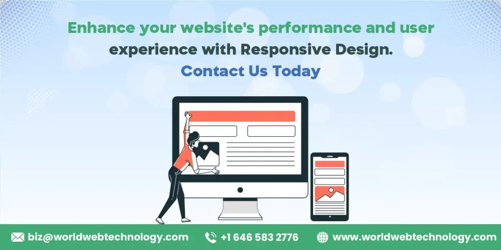
Wrapping Up
Responsive website design is no longer just a trend but an essential requirement for ecommerce businesses of today. With one step, you can improve your website performance and user experience and drive sales, especially when coupled with hyva theme development services.
Compelling, user-centric websites are the backbone of online businesses. They signify who you are in the competitive space of marketing. To find the ideal e-commerce website development company, explore the list of top web development companies.
World Web Technology
World Web Technology is an India and USA-based Web Design, Web Development, and Mobile App Development Company that offers creative and proven web solutions around the globe.
Most Popular Categories
Discover top categories on our blog, featuring WordPress, PHP, eCommerce, and Shopify insights and tutorials.


Featured Insights
Immerse yourself in our passion for sharing the latest industry news, cutting-edge technologies, and insightful articles. Explore the depths of knowledge with us.
10 Proven Strategies to Increase Customer Lifetime Value with WordPress